objective

to elevate the presence of 'the whitehouse', a heritage listed cafe in the heart of the university of new south wales.


Tags

branding, identity, print design, digital design, signage

mockupheader.jpg

the old identity was lacking a strong sense of self and presence.
It got lost among collateral and needed a creative boost to set the brand apart.


Whspreadsv02.jpg
Whspreadsv022.jpg
whitehouse3

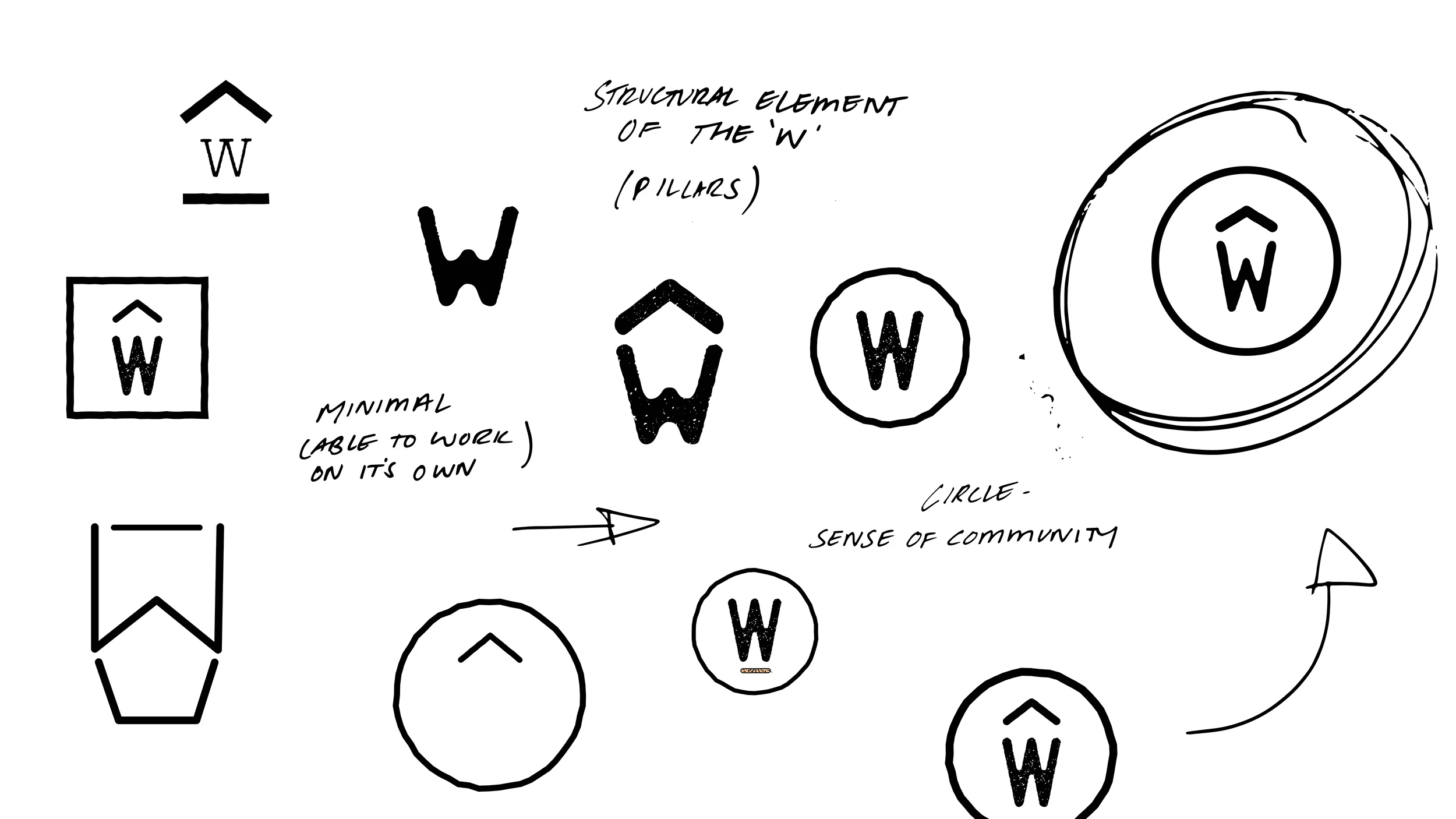
THe final logo is clear and minimal. it is stripped down to its core. by linking the letter 'w' with the structural element of a roof we were able to pay homage to the buildings structural history. 


Whspreadsv024.jpg

The illustrated element of the 't' was important for us to add into the identity.
it came from the floral cutouts found along the whitehouse and was the element that the client appreciated the most. we worked hard to bring this historic element into the now.


Whspreadsv025.jpg
Whspreadsv026.jpg

DEVELOPMENT

THE COLOUR SCHEME WAS DEVELOPED FROM THE COLOURS ASSOCIATED WITH GROUND COFFEE, WARMTH and THE NATURAL WORLD.

THe typography was also decided on because of its natural aesthetic. hamurz font has
a slight textural grain and special elite was chosen because of its imperfects angels
and weight. 


ILLUSTRATIONS

HAND SKETCHED IMAGES WERE USED TO BRING life and movement into the brand. inspired by wood grain textures, this style of illustration adds the rustic feel to the brand.

Whspreadsv027.jpg
Whspreadsv028.jpg


as the menu is one of the key components of a cafe it was INCREDIBLY important to make it both clear to read, as well as visually engaging. 
THe Typography played a huge part in this. the contrast of the two font heightS helped elevate the menus visual space, giving the reader a chance to digest the copy.

Whspreadsv029.jpg
Whinstagramx2.jpg
Whspreadsv0210.jpg
Whspreadsv0211.jpg
Whspreadsv0212.jpg
Whspreadsv0213.jpg